Slides
Failed to execute the [groovy] macro. Cause: [The execution of the [groovy] script macro is not allowed in [incubator:Presentation.PresentationSheet]. Check the rights of its last author or the parameters if it's rendered from another script.]. Click on this message for details.
org.xwiki.rendering.macro.MacroExecutionException: The execution of the [groovy] script macro is not allowed in [incubator:Presentation.PresentationSheet]. Check the rights of its last author or the parameters if it's rendered from another script.
at org.xwiki.rendering.macro.script.AbstractScriptMacro.execute(AbstractScriptMacro.java:178)
at org.xwiki.rendering.macro.script.AbstractScriptMacro.execute(AbstractScriptMacro.java:58)
at org.xwiki.rendering.internal.transformation.macro.MacroTransformation.transform(MacroTransformation.java:311)
at org.xwiki.rendering.internal.transformation.DefaultRenderingContext.transformInContext(DefaultRenderingContext.java:183)
at org.xwiki.rendering.internal.transformation.DefaultTransformationManager.performTransformations(DefaultTransformationManager.java:88)
at org.xwiki.display.internal.DocumentContentAsyncExecutor.executeInCurrentExecutionContext(DocumentContentAsyncExecutor.java:396)
at org.xwiki.display.internal.DocumentContentAsyncExecutor.execute(DocumentContentAsyncExecutor.java:269)
at org.xwiki.display.internal.DocumentContentAsyncRenderer.execute(DocumentContentAsyncRenderer.java:112)
at org.xwiki.rendering.async.internal.block.AbstractBlockAsyncRenderer.render(AbstractBlockAsyncRenderer.java:157)
at org.xwiki.rendering.async.internal.block.AbstractBlockAsyncRenderer.render(AbstractBlockAsyncRenderer.java:54)
at org.xwiki.rendering.async.internal.DefaultAsyncRendererExecutor.syncRender(DefaultAsyncRendererExecutor.java:290)
at org.xwiki.rendering.async.internal.DefaultAsyncRendererExecutor.render(DefaultAsyncRendererExecutor.java:267)
at org.xwiki.rendering.async.internal.block.DefaultBlockAsyncRendererExecutor.execute(DefaultBlockAsyncRendererExecutor.java:125)
at org.xwiki.display.internal.DocumentContentDisplayer.display(DocumentContentDisplayer.java:67)
at org.xwiki.display.internal.DocumentContentDisplayer.display(DocumentContentDisplayer.java:43)
at org.xwiki.display.internal.DefaultDocumentDisplayer.display(DefaultDocumentDisplayer.java:96)
at org.xwiki.display.internal.DefaultDocumentDisplayer.display(DefaultDocumentDisplayer.java:39)
at org.xwiki.sheet.internal.SheetDocumentDisplayer.display(SheetDocumentDisplayer.java:245)
at org.xwiki.sheet.internal.SheetDocumentDisplayer.applySheet(SheetDocumentDisplayer.java:225)
at org.xwiki.sheet.internal.SheetDocumentDisplayer.maybeDisplayWithSheet(SheetDocumentDisplayer.java:180)
at org.xwiki.sheet.internal.SheetDocumentDisplayer.display(SheetDocumentDisplayer.java:111)
at org.xwiki.sheet.internal.SheetDocumentDisplayer.display(SheetDocumentDisplayer.java:52)
at org.xwiki.display.internal.ConfiguredDocumentDisplayer.display(ConfiguredDocumentDisplayer.java:68)
at org.xwiki.display.internal.ConfiguredDocumentDisplayer.display(ConfiguredDocumentDisplayer.java:42)
at com.xpn.xwiki.doc.XWikiDocument.display(XWikiDocument.java:1388)
at com.xpn.xwiki.doc.XWikiDocument.getRenderedContent(XWikiDocument.java:1524)
at com.xpn.xwiki.doc.XWikiDocument.displayDocument(XWikiDocument.java:1474)
at com.xpn.xwiki.doc.XWikiDocument.displayDocument(XWikiDocument.java:1443)
at com.xpn.xwiki.api.Document.displayDocument(Document.java:788)
at jdk.internal.reflect.GeneratedMethodAccessor656.invoke(Unknown Source)
at java.base/jdk.internal.reflect.DelegatingMethodAccessorImpl.invoke(Unknown Source)
at java.base/java.lang.reflect.Method.invoke(Unknown Source)
at org.apache.velocity.util.introspection.UberspectImpl$VelMethodImpl.doInvoke(UberspectImpl.java:571)
at org.apache.velocity.util.introspection.UberspectImpl$VelMethodImpl.invoke(UberspectImpl.java:554)
at org.apache.velocity.runtime.parser.node.ASTMethod.execute(ASTMethod.java:221)
at org.apache.velocity.runtime.parser.node.ASTReference.execute(ASTReference.java:368)
at org.apache.velocity.runtime.parser.node.ASTReference.value(ASTReference.java:704)
at org.apache.velocity.runtime.parser.node.ASTExpression.value(ASTExpression.java:75)
at org.apache.velocity.runtime.parser.node.ASTSetDirective.render(ASTSetDirective.java:242)
at org.apache.velocity.runtime.parser.node.ASTBlock.render(ASTBlock.java:147)
at org.apache.velocity.runtime.parser.node.SimpleNode.render(SimpleNode.java:439)
at org.apache.velocity.runtime.parser.node.ASTIfStatement.render(ASTIfStatement.java:190)
at org.apache.velocity.runtime.parser.node.ASTBlock.render(ASTBlock.java:147)
at org.xwiki.velocity.internal.directive.TryCatchDirective.render(TryCatchDirective.java:86)
at org.apache.velocity.runtime.parser.node.ASTDirective.render(ASTDirective.java:304)
at org.apache.velocity.runtime.parser.node.SimpleNode.render(SimpleNode.java:439)
at org.apache.velocity.Template.merge(Template.java:358)
at org.apache.velocity.Template.merge(Template.java:262)
at org.xwiki.velocity.internal.InternalVelocityEngine.evaluate(InternalVelocityEngine.java:225)
at com.xpn.xwiki.internal.template.VelocityTemplateEvaluator.evaluateContent(VelocityTemplateEvaluator.java:105)
at com.xpn.xwiki.internal.template.TemplateAsyncRenderer.evaluateContent(TemplateAsyncRenderer.java:219)
at com.xpn.xwiki.internal.template.TemplateAsyncRenderer.renderVelocity(TemplateAsyncRenderer.java:174)
at com.xpn.xwiki.internal.template.TemplateAsyncRenderer.render(TemplateAsyncRenderer.java:135)
at com.xpn.xwiki.internal.template.TemplateAsyncRenderer.render(TemplateAsyncRenderer.java:54)
at org.xwiki.rendering.async.internal.DefaultAsyncRendererExecutor.lambda$syncRender$0(DefaultAsyncRendererExecutor.java:284)
at com.xpn.xwiki.internal.security.authorization.DefaultAuthorExecutor.call(DefaultAuthorExecutor.java:98)
at org.xwiki.rendering.async.internal.DefaultAsyncRendererExecutor.syncRender(DefaultAsyncRendererExecutor.java:284)
at org.xwiki.rendering.async.internal.DefaultAsyncRendererExecutor.render(DefaultAsyncRendererExecutor.java:267)
at org.xwiki.rendering.async.internal.block.DefaultBlockAsyncRendererExecutor.render(DefaultBlockAsyncRendererExecutor.java:154)
at com.xpn.xwiki.internal.template.InternalTemplateManager.render(InternalTemplateManager.java:904)
at com.xpn.xwiki.internal.template.InternalTemplateManager.renderFromSkin(InternalTemplateManager.java:866)
at com.xpn.xwiki.internal.template.InternalTemplateManager.render(InternalTemplateManager.java:853)
at com.xpn.xwiki.internal.template.InternalTemplateManager.renderNoException(InternalTemplateManager.java:808)
at com.xpn.xwiki.internal.template.InternalTemplateManager.renderNoException(InternalTemplateManager.java:800)
at com.xpn.xwiki.internal.template.DefaultTemplateManager.renderNoException(DefaultTemplateManager.java:79)
at com.xpn.xwiki.internal.template.DefaultTemplateManager.renderNoException(DefaultTemplateManager.java:73)
at org.xwiki.template.script.TemplateScriptService.render(TemplateScriptService.java:54)
at jdk.internal.reflect.GeneratedMethodAccessor298.invoke(Unknown Source)
at java.base/jdk.internal.reflect.DelegatingMethodAccessorImpl.invoke(Unknown Source)
at java.base/java.lang.reflect.Method.invoke(Unknown Source)
at org.apache.velocity.util.introspection.UberspectImpl$VelMethodImpl.doInvoke(UberspectImpl.java:571)
at org.apache.velocity.util.introspection.UberspectImpl$VelMethodImpl.invoke(UberspectImpl.java:554)
at org.apache.velocity.runtime.parser.node.ASTMethod.execute(ASTMethod.java:221)
at org.apache.velocity.runtime.parser.node.ASTReference.execute(ASTReference.java:368)
at org.apache.velocity.runtime.parser.node.ASTReference.render(ASTReference.java:492)
at org.apache.velocity.runtime.parser.node.ASTBlock.render(ASTBlock.java:147)
at org.apache.velocity.runtime.directive.VelocimacroProxy.render(VelocimacroProxy.java:218)
at org.apache.velocity.runtime.directive.RuntimeMacro.render(RuntimeMacro.java:331)
at org.apache.velocity.runtime.directive.RuntimeMacro.render(RuntimeMacro.java:261)
at org.apache.velocity.runtime.parser.node.ASTDirective.render(ASTDirective.java:304)
at org.apache.velocity.runtime.parser.node.ASTBlock.render(ASTBlock.java:147)
at org.apache.velocity.runtime.parser.node.ASTIfStatement.render(ASTIfStatement.java:171)
at org.apache.velocity.runtime.parser.node.ASTBlock.render(ASTBlock.java:147)
at org.apache.velocity.runtime.parser.node.SimpleNode.render(SimpleNode.java:439)
at org.apache.velocity.runtime.parser.node.ASTIfStatement.render(ASTIfStatement.java:190)
at org.apache.velocity.runtime.parser.node.SimpleNode.render(SimpleNode.java:439)
at org.apache.velocity.Template.merge(Template.java:358)
at org.apache.velocity.Template.merge(Template.java:262)
at org.xwiki.velocity.internal.InternalVelocityEngine.evaluate(InternalVelocityEngine.java:225)
at com.xpn.xwiki.internal.template.VelocityTemplateEvaluator.evaluateContent(VelocityTemplateEvaluator.java:105)
at com.xpn.xwiki.internal.template.TemplateAsyncRenderer.evaluateContent(TemplateAsyncRenderer.java:219)
at com.xpn.xwiki.internal.template.TemplateAsyncRenderer.renderVelocity(TemplateAsyncRenderer.java:174)
at com.xpn.xwiki.internal.template.TemplateAsyncRenderer.render(TemplateAsyncRenderer.java:135)
at com.xpn.xwiki.internal.template.TemplateAsyncRenderer.render(TemplateAsyncRenderer.java:54)
at org.xwiki.rendering.async.internal.DefaultAsyncRendererExecutor.lambda$syncRender$0(DefaultAsyncRendererExecutor.java:284)
at com.xpn.xwiki.internal.security.authorization.DefaultAuthorExecutor.call(DefaultAuthorExecutor.java:98)
at org.xwiki.rendering.async.internal.DefaultAsyncRendererExecutor.syncRender(DefaultAsyncRendererExecutor.java:284)
at org.xwiki.rendering.async.internal.DefaultAsyncRendererExecutor.render(DefaultAsyncRendererExecutor.java:267)
at org.xwiki.rendering.async.internal.block.DefaultBlockAsyncRendererExecutor.render(DefaultBlockAsyncRendererExecutor.java:154)
at com.xpn.xwiki.internal.template.InternalTemplateManager.render(InternalTemplateManager.java:904)
at com.xpn.xwiki.internal.template.InternalTemplateManager.renderFromSkin(InternalTemplateManager.java:866)
at com.xpn.xwiki.internal.template.InternalTemplateManager.renderFromSkin(InternalTemplateManager.java:846)
at com.xpn.xwiki.internal.template.InternalTemplateManager.render(InternalTemplateManager.java:832)
at com.xpn.xwiki.internal.template.DefaultTemplateManager.render(DefaultTemplateManager.java:91)
at com.xpn.xwiki.internal.template.DefaultTemplateManager.render(DefaultTemplateManager.java:85)
at com.xpn.xwiki.XWiki.evaluateTemplate(XWiki.java:2564)
at com.xpn.xwiki.web.Utils.parseTemplate(Utils.java:180)
at com.xpn.xwiki.web.XWikiAction.execute(XWikiAction.java:651)
at com.xpn.xwiki.web.XWikiAction.execute(XWikiAction.java:339)
at com.xpn.xwiki.web.LegacyActionServlet.service(LegacyActionServlet.java:108)
at javax.servlet.http.HttpServlet.service(HttpServlet.java:733)
at org.apache.catalina.core.ApplicationFilterChain.internalDoFilter(ApplicationFilterChain.java:227)
at org.apache.catalina.core.ApplicationFilterChain.doFilter(ApplicationFilterChain.java:162)
at com.xpn.xwiki.web.ActionFilter.doFilter(ActionFilter.java:122)
at org.apache.catalina.core.ApplicationFilterChain.internalDoFilter(ApplicationFilterChain.java:189)
at org.apache.catalina.core.ApplicationFilterChain.doFilter(ApplicationFilterChain.java:162)
at org.xwiki.wysiwyg.filter.ConversionFilter.doFilter(ConversionFilter.java:61)
at org.apache.catalina.core.ApplicationFilterChain.internalDoFilter(ApplicationFilterChain.java:189)
at org.apache.catalina.core.ApplicationFilterChain.doFilter(ApplicationFilterChain.java:162)
at org.apache.tomcat.websocket.server.WsFilter.doFilter(WsFilter.java:53)
at org.apache.catalina.core.ApplicationFilterChain.internalDoFilter(ApplicationFilterChain.java:189)
at org.apache.catalina.core.ApplicationFilterChain.doFilter(ApplicationFilterChain.java:162)
at org.xwiki.container.servlet.filters.internal.SetHTTPHeaderFilter.doFilter(SetHTTPHeaderFilter.java:63)
at org.apache.catalina.core.ApplicationFilterChain.internalDoFilter(ApplicationFilterChain.java:189)
at org.apache.catalina.core.ApplicationFilterChain.doFilter(ApplicationFilterChain.java:162)
at org.xwiki.resource.servlet.RoutingFilter.doFilter(RoutingFilter.java:132)
at org.apache.catalina.core.ApplicationFilterChain.internalDoFilter(ApplicationFilterChain.java:189)
at org.apache.catalina.core.ApplicationFilterChain.doFilter(ApplicationFilterChain.java:162)
at org.xwiki.container.servlet.filters.internal.SavedRequestRestorerFilter.doFilter(SavedRequestRestorerFilter.java:208)
at org.apache.catalina.core.ApplicationFilterChain.internalDoFilter(ApplicationFilterChain.java:189)
at org.apache.catalina.core.ApplicationFilterChain.doFilter(ApplicationFilterChain.java:162)
at org.xwiki.container.servlet.filters.internal.SetCharacterEncodingFilter.doFilter(SetCharacterEncodingFilter.java:117)
at org.apache.catalina.core.ApplicationFilterChain.internalDoFilter(ApplicationFilterChain.java:189)
at org.apache.catalina.core.ApplicationFilterChain.doFilter(ApplicationFilterChain.java:162)
at org.apache.catalina.core.StandardWrapperValve.invoke(StandardWrapperValve.java:202)
at org.apache.catalina.core.StandardContextValve.invoke(StandardContextValve.java:97)
at org.apache.catalina.authenticator.AuthenticatorBase.invoke(AuthenticatorBase.java:542)
at org.apache.catalina.core.StandardHostValve.invoke(StandardHostValve.java:143)
at org.apache.catalina.valves.ErrorReportValve.invoke(ErrorReportValve.java:92)
at org.apache.catalina.valves.AbstractAccessLogValve.invoke(AbstractAccessLogValve.java:687)
at org.apache.catalina.core.StandardEngineValve.invoke(StandardEngineValve.java:78)
at org.apache.catalina.connector.CoyoteAdapter.service(CoyoteAdapter.java:354)
at org.apache.coyote.http11.Http11Processor.service(Http11Processor.java:382)
at org.apache.coyote.AbstractProcessorLight.process(AbstractProcessorLight.java:65)
at org.apache.coyote.AbstractProtocol$ConnectionHandler.process(AbstractProtocol.java:888)
at org.apache.tomcat.util.net.NioEndpoint$SocketProcessor.doRun(NioEndpoint.java:1684)
at org.apache.tomcat.util.net.SocketProcessorBase.run(SocketProcessorBase.java:49)
at java.base/java.util.concurrent.ThreadPoolExecutor.runWorker(Unknown Source)
at java.base/java.util.concurrent.ThreadPoolExecutor$Worker.run(Unknown Source)
at org.apache.tomcat.util.threads.TaskThread$WrappingRunnable.run(TaskThread.java:61)
at java.base/java.lang.Thread.run(Unknown Source)
Part 1: History, Layout, Variables ++
Ecaterina Moraru — 7 December 2013 —
- What is CSS?
- How the language evolved?
- Some techniques and their usage:
- Why it needed to evolve?
Cascading Style Sheets (CSS) is a style sheet language used for describing the presentation semantics (the look and formatting) of a document written in a markup language.
Its most common application is to style web pages written in HTML and XHTML, but the language can also be applied to any kind of XML document, including plain XML, SVG and XUL.
Wikipedia
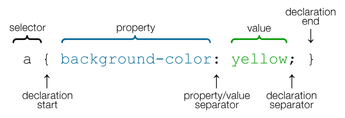
- The property is an identifier that defines which feature is considered
- The value describe how the feature must be handle by the engine
- A property and value pair is called a declaration
- Declarations are grouped in blocks
- Each block is preceded by a selector
- The pair selector-declarations block is called a rule
A simple syntax doesn't make an easy language
Hugo Giraudel, CSS is easy... syntactically, 2013
- Separation of concerns (structure, presentation, behavior)
- Easier to maintain sites
- Share style sheets across pages
- Helps pages load faster
- Tailor pages to different environments
- Separation of development roles (designer, developer)
- Handles the styling of the interface
- Not using just text, but adding beautiful effects
- Replaces images with native features
- Layout
- With CSS you can achieve anything (most of things)
The CSS specifications are maintained by W3C's CSSWG
| 1990, Jan | HTML proposed by Tim Berners-Lee |
| 1999, Dec 24 | HTML 4.01 Recommendation |
| 2013, Aug 06 | HTML 5 Candidate Recommendation (13+ WD since Jan 2008) |
| 1994, May | CSS proposed by Håkon Wium Lie and Bert Bos |
| 1996, Dec 17 | CSS 1 Recommendation |
| 1998, May 12 | CSS 2 Recommendation |
| 1999, Jun | CSS 3 earliest drafts |
| 2011, Jun 07 | CSS 2.1 Recommendation (WD 2002, CR 2004, WD 2005, CR 2007, CR 2009, WD 2010, PR 2011) |
Rather than attempting to shove dozens of updates into a single monolithic specification, it will be much easier and more efficient to be able to update individual pieces of the specification.
Modules will enable CSS to be updated in a more timely and precise fashion, thus allowing for a more flexible and timely evolution of the specification as a whole...
W3C, 2012
- Unlike a large single specification, CSS 3 is divided into modules
- Due to the modularization, different modules have different stability and statuses
- Each module (50+) can level up independently
- The term CSS 3 refers to everything published after CSS 2.1
- There's no such thing as CSS 4, but there are level 4 modules

- There is nothing wrong with HTML 4.1 and CSS 2.1 but, everything else evolved
- People started to use the standards for things they weren't intended for
- Browsers implemented new features
- New browsing devices appeared
- HTML 5 and CSS 3 were designed to:
- Be backwards compatible
- Compete with plugin tech
- Add more efficient, powerful features
- Be as accessible as possible
- The layout mode determines the position, the size and the order of boxes based on the way they interact with their siblings and ancestor boxes
- Layout:
- Block — designed for documents (float, multiple columns)
- Inline — designed for text
- Table — designed for tables
- Positioned — designed for positioning elements (without much interaction with other elements)
- Flexible box — designed for complex pages that can be resized
- Grid — designed for elements relatively to a fixed grid
td {
border: 0;
width: 50%;
}
<table>
<tr>
<td>Lorem ipsum dolor sit amet, consectetur adipisicing elit, sed do eiusmod
tempor incididunt ut labore et dolore magna aliqua. Ut enim ad minim veniam,
quis nostrud</td>
<td>exercitation ullamco laboris nisi ut aliquip ex ea commodo consequat.</td>
</tr>
</table>
| Lorem ipsum dolor sit amet, consectetur adipisicing elit, sed do eiusmod
tempor incididunt ut labore et dolore magna aliqua. Ut enim ad minim veniam,
quis nostrud |
exercitation ullamco laboris nisi ut aliquip ex ea commodo consequat. |
<div>Lorem ipsum dolor sit amet, consectetur adipisicing elit, sed do eiusmod
tempor incididunt ut labore et dolore magna aliqua. Ut enim ad minim veniam,
quis nostrud</div>
<div>exercitation ullamco laboris nisi ut aliquip ex ea commodo consequat.</div>
Lorem ipsum dolor sit amet, consectetur adipisicing elit, sed do eiusmod
tempor incididunt ut
labore et dolore magna aliqua. Ut enim ad minim veniam, quis nostrud
exercitation ullamco laboris nisi ut aliquip ex ea commodo consequat.
- Being a generic container it needs additional styling
Lorem ipsum dolor sit amet, consectetur adipisicing elit, sed do eiusmod
tempor incididunt ut labore et dolore magna aliqua. Ut enim ad minim veniam,
quis nostrud
exercitation ullamco laboris nisi ut
aliquip ex ea commodo consequat.
div {
float: left;
width: 50%;
}
Lorem ipsum dolor sit amet, consectetur adipisicing elit, sed do eiusmod
tempor incididunt ut labore et dolore magna aliqua. Ut enim ad minim veniam,
quis nostrud
exercitation ullamco laboris nisi ut aliquip ex ea commodo consequat.
- No float: center
- It needs additional markup to clear the float or CSS 3's :after selector
.clearfix { clear: both; }
- Using position: absolute
- Properties: position, z-index
.parent {
position: relative;
}
div.second {
position: absolute;
right: 0;
top: 0;
width: 50%;
}
Lorem ipsum dolor sit amet, consectetur adipisicing elit, sed do eiusmod
tempor incididunt ut labore et dolore magna aliqua. Ut enim ad minim veniam,
quis nostrud
exercitation ullamco laboris nisi ut aliquip ex ea commodo consequat.
- Using display: inline-block, block, inline
div {
display: inline-block;
width: 50%;
}
<div>Lorem ipsum dolor sit amet, consectetur adipisicing elit ... </div>
<div>exercitation ullamco laboris nisi ut aliquip ex ea commodo consequat.</div>
Lorem ipsum dolor sit amet, consectetur adipisicing elit, sed do eiusmod
tempor incididunt ut labore et dolore magna aliqua. Ut enim ad minim veniam,
quis nostrud
exercitation ullamco laboris nisi ut aliquip ex ea commodo consequat.
- Problem: spacing between blocks
- Can be combined with vertical-align property
- Using display: table-cell
div {
display: table-cell;
width: 50%;
}
<div>Lorem ipsum dolor sit amet, consectetur adipisicing elit, sed do eiusmod
tempor incididunt ut labore et dolore magna aliqua. Ut enim ad minim veniam,
quis nostrud</div>
<div>exercitation ullamco laboris nisi ut aliquip ex ea commodo consequat.</div>
Lorem ipsum dolor sit amet, consectetur adipisicing elit, sed do eiusmod
tempor incididunt ut labore et dolore magna aliqua. Ut enim ad minim veniam,
quis nostrud
exercitation ullamco laboris nisi ut aliquip ex ea commodo consequat.
- Needs to be used in conjunction with table and table-row
Method: Columns
- Extends Block Layout Mode
- Properties: columns, column-count, column-width, column-gap, etc.
<div>Lorem ipsum dolor sit amet, consectetur adipisicing elit, sed do eiusmod
tempor incididunt ut labore et dolore magna aliqua. Ut enim ad minim veniam,
quis nostrud exercitation ullamco laboris nisi ut aliquip ex ea commodo consequat.</div>
Lorem ipsum dolor sit amet, consectetur adipisicing elit,
sed do eiusmod tempor incididunt ut labore et dolore magna aliqua. Ut enim ad minim veniam,
quis nostrud exercitation ullamco laboris nisi ut aliquip ex ea commodo consequat.
- Using display:flex, flex-direction, align-items, order
.parent {
display: flex;
}
div {
width: 50%;
}
<div>Lorem ipsum dolor sit amet, consectetur adipisicing elit, sed do eiusmod
tempor incididunt ut labore et dolore magna aliqua. Ut enim ad minim veniam,
quis nostrud</div>
<div>exercitation ullamco laboris nisi ut aliquip ex ea commodo consequat.</div>
Lorem ipsum dolor sit amet, consectetur adipisicing elit, sed do eiusmod
tempor incididunt ut labore et dolore magna aliqua. Ut enim ad minim veniam,
quis nostrud
exercitation ullamco laboris nisi ut aliquip ex ea commodo consequat.
- Currently supported just by IE10 with -ms- prefix
.parent {
display: grid;
grid-template: "1 2";
}
div.first {
grid-area: "1";
}
div.second {
grid-area: "2";
}
Other Layout Modules:
Regions
Exclusions and Shapes
- Remove the need for additional markup
- Targeting semantic markup and styling
- Choosing the most flexible method
- Choosing the most accessible method
- Some methods chosen because of browser compatibility
- Some methods have slower browser rendering
- Some methods are specially designed to do a certain thing
- CSS 3 is Turing complete because it can program a Rule 110 automaton
- Execution is done with HTML structure and user interaction (or JS)
- By itself it can generate 1 iteration of the state-machine
- There is no programmatic way to use the output as input or to loop
- CSS is designed to be a declarative language, not an imperative one
- It's missing the variables, functions and control structures (if, for, while)
111 110 101 100 011 010 001 000 Pattern rules
0 1 1 0 1 1 1 0 Source
- In CSS the concept of time-changing values is not present yet
- The purpose is to have reusable values throughout the style
- Notion of cascading variables (10 April 2012)
:root {
var-contrast-color: #d67128;
var-default-margin: 10px;
}
div {
color: var(contrast-color);
margin-right: calc(var(default-margin) * 2);
}
- Java-based template engine, started in 2000
- Templates are parsed and rendered, not compiled
- Uses $variables and #macros
#set ($linkColor = '#528BA1')
#macro (css3_boxSizing $value)
#set ($browserVariants = ['-moz-', '-webkit-', ''])
#foreach ($bvar in $browserVariants)
${bvar}box-sizing: $value;
#end
#end
#template('colorThemeInit.vm')
div {
color: $linkColor;
#css3_boxSizing('border-box')
}
- Alternatives:
- LESS
- Dynamic stylesheet language in JavaScript
- Sass
- Scripting language coded in Ruby
- Languages that extends CSS:
- Compiles into regular CSS syntax
- Functions which transform colors, manipulate strings, do maths, etc.
lighten(@color, 10%); /* returns a color 10% lighter than @color */
saturate(@color, 10%); /* returns a color 10% more saturated than @color */
@for $i from 1 through 3 {
.item-#{$i} { width: 2em * $i; }
}
- Mixins lets you make groups of CSS declarations that you want to reuse
- Extends lets you share a set of CSS properties from one selector to another
- Use :extend to minimize the output, especially when re-using .clearfix class for other elements
- Map customized sections of a library (Bootstrap) to you classes
- Using :extend(.clearfix all) will target nested selectors
.clearfloats:extend(.clearfix all) {}
input.button, .buttonwrapper button, .buttonwrapper a {
.btn;
.btn-primary;
}
.clearfix:after,
.clearfloats:after {
clear: both;
}
- Maintainability, Reusability
- Save time (nesting, mixins)
- Powerful functionality, simplifying some aspects
- Making the language more complex
- Syntax more/less faithful to traditional CSS
- Third-party dependencies
- Threat to replace the standard?
- Created for simple text now it needs to accommodate complex application development
- Language consistency
- Missing use cases from specifications
- Less unsemantic markup
- Better built in accessibility
- Less Flash / Photoshop / JavaScript
- Esthetic effects
- Form validation
- Animations
- Web Fonts
- etc.

The only constant is change
Isaac Asimov
My Own View
1978
- Reuse
- Separation of concerns
- Performance
- Cross Browser
- There are a billion ways to do one thing
- Diversity
- Best practices
- Standards
- CSS allows you to work in the open
- Review code with Firebug
- Share techniques
- Community collaboration


